The Senquip Portal is a secure, cloud-based platform hosted on Amazon Web Services (AWS), designed to provide powerful management and visualisation tools for your Senquip devices.
The Portal enables users to:
View dashboards that display data across groups of devices
Access detailed device pages showing real-time and historical sensor data
Perform device management including configuration and firmware updates
Handle user management with role-based access control
Maintain long-term data storage for historical analysis and compliance
Manage events with configurable warnings and alarms
Manage device subscriptions
The Senquip Portal provides a streamlined and scalable interface used to monitor, manage, and respond to field data from anywhere in the world.
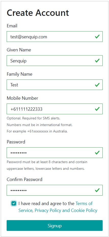
If you do not have an account on the Senquip Portal, you will need to create one. There are no charges for creating an account on the Senquip Portal and a credit card is not required.
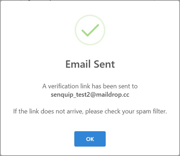
A verification email will be sent to the email address provided. Click on the link in the email to verify your account. The email address must be verified as important system updates, alerts, warnings, and alarm messages will be sent to the email address.
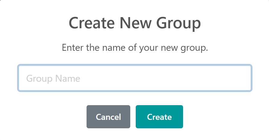
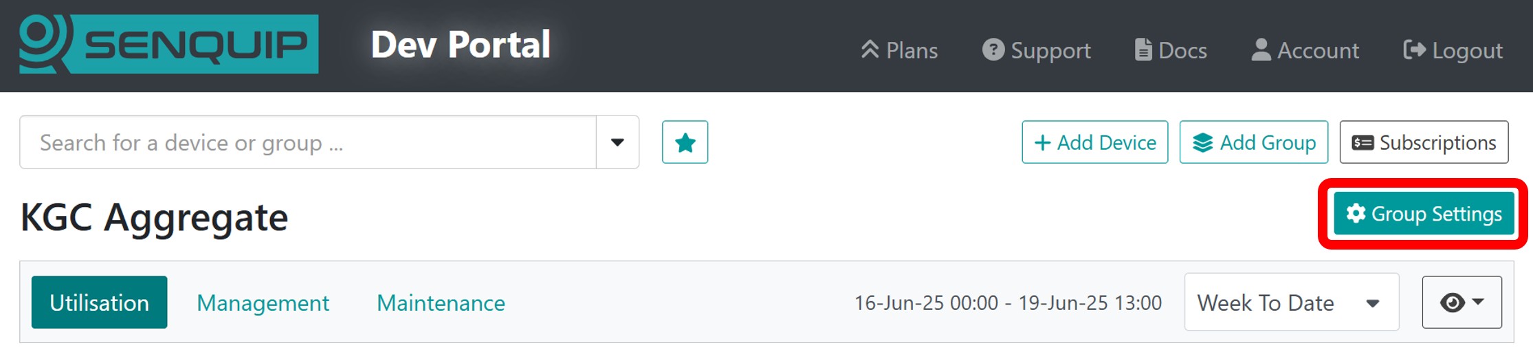
Select a name for your group that will be meaningful to the indented user group and press Create. The group name can be changed later in the Group Settings.
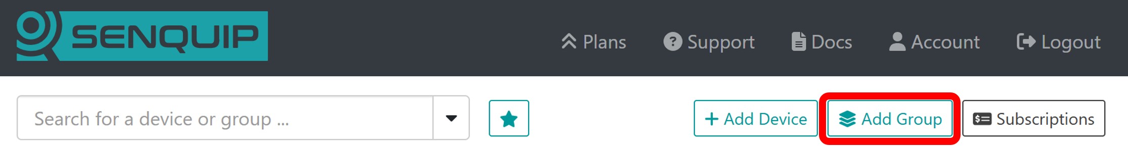
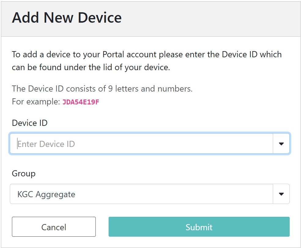
By pressing the Add Device button and entering the device ID. If you are adding a new device to your account, you will be required to enter the setup password.
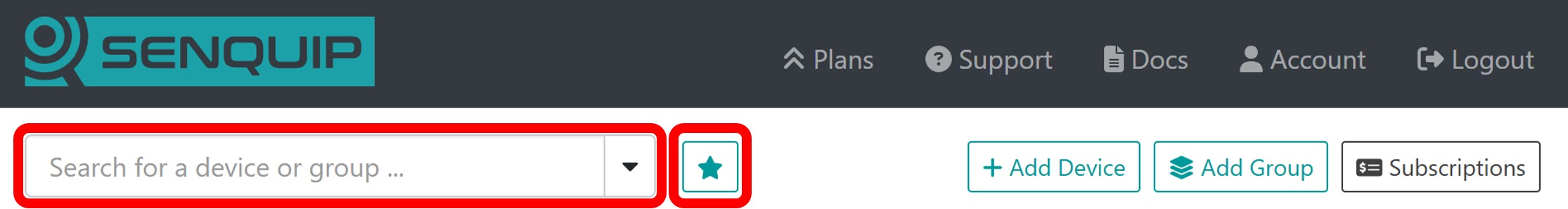
Use the search bar at the top of the page to find devices and groups. Search by group name, device ID, or device name. The Favourites button can be used to identify the last few devices and groups accessed, and to mark devices and groups as favourites.
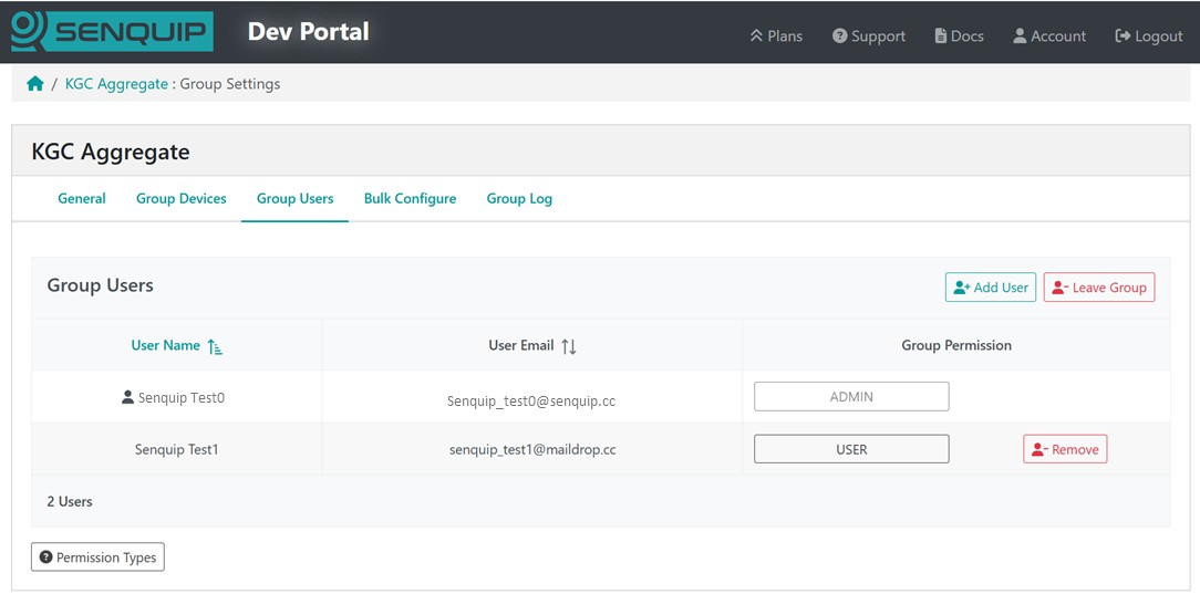
The Group Users option allows users to be added or removed from a group. Where users are added, they must be allocated appropriate permissions for the group.
Allowed Permission
Admin
User
Operator
View
View data
Yes
Yes
Yes
Yes
Trigger device actions
Yes
Yes
Yes
View users
Yes
Yes
Change device settings
Yes
Yes
View or edit script*
Yes
Yes
View server log
Yes
View device passwords
Yes
Add or remove group users
Yes
Add or remove group devices
Yes
Import and export settings
Yes
Note
If you have created a private group and want to share that group, you will need to have administrator permissions for all devices in that group.
Note
Users should be added with the minimum permission level required to perform their function.
Warning
Anyone who has the device ID and setup password can add the device to their account with Admin permissions.
In the example below, Senquip Test0 is the owner of the group and has Administrator access to all devices in the group. Senquip Test1 has been added to the group with permission level User.
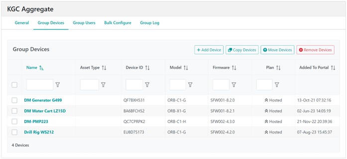
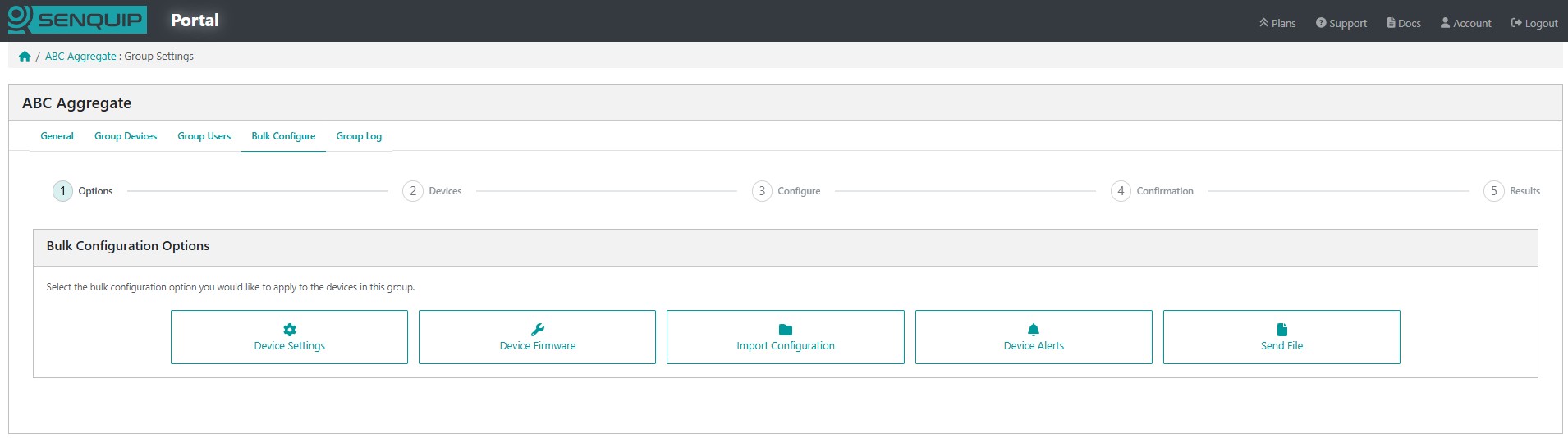
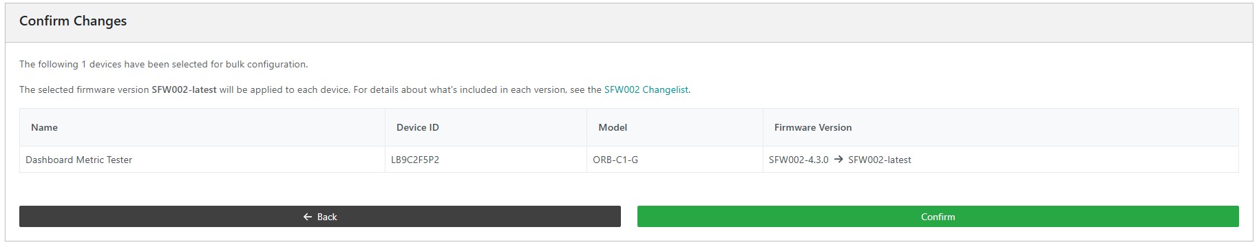
Bulk configuration of devices allows for settings, firmware, configuration, alerts, and files upload functionality across many devices at the same time.
When applying settings via the Groups feature, changes will be pushed to all selected devices simultaneously. This is a powerful tool, but it carries significant risk if configurations have not been properly validated.
Before deploying a Group update:
Ensure that all devices listed are intended to receive the same configuration.
Double-check settings such as network SSID, endpoint details, and peripheral configurations.
Always test the configuration on a single device first to confirm safe behaviour.
As shown in the Portal, users must acknowledge the following before applying the update:
Bulk configuration is efficient, but unforgiving. Please review all settings carefully - especially when managing devices in remote or critical environments.
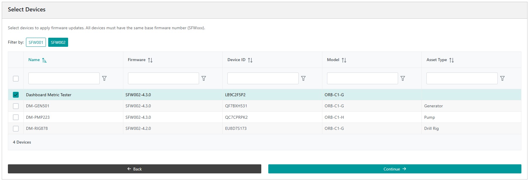
The Bulk Firmware Update tool allows firmware to be updated across multiple devices simultaneously.
Devices are grouped and filtered based on their firmware family (e.g., SFW001, SFW002, SFW003).
A selection button at the top of the interface ensures that only devices within the same base firmware can be chosen.
Note
You cannot update between different firmware numbers.
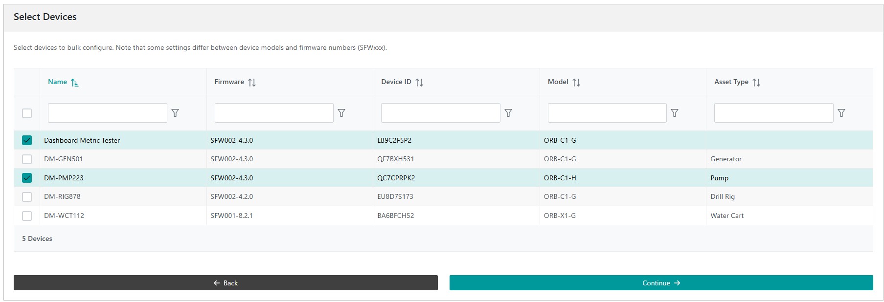
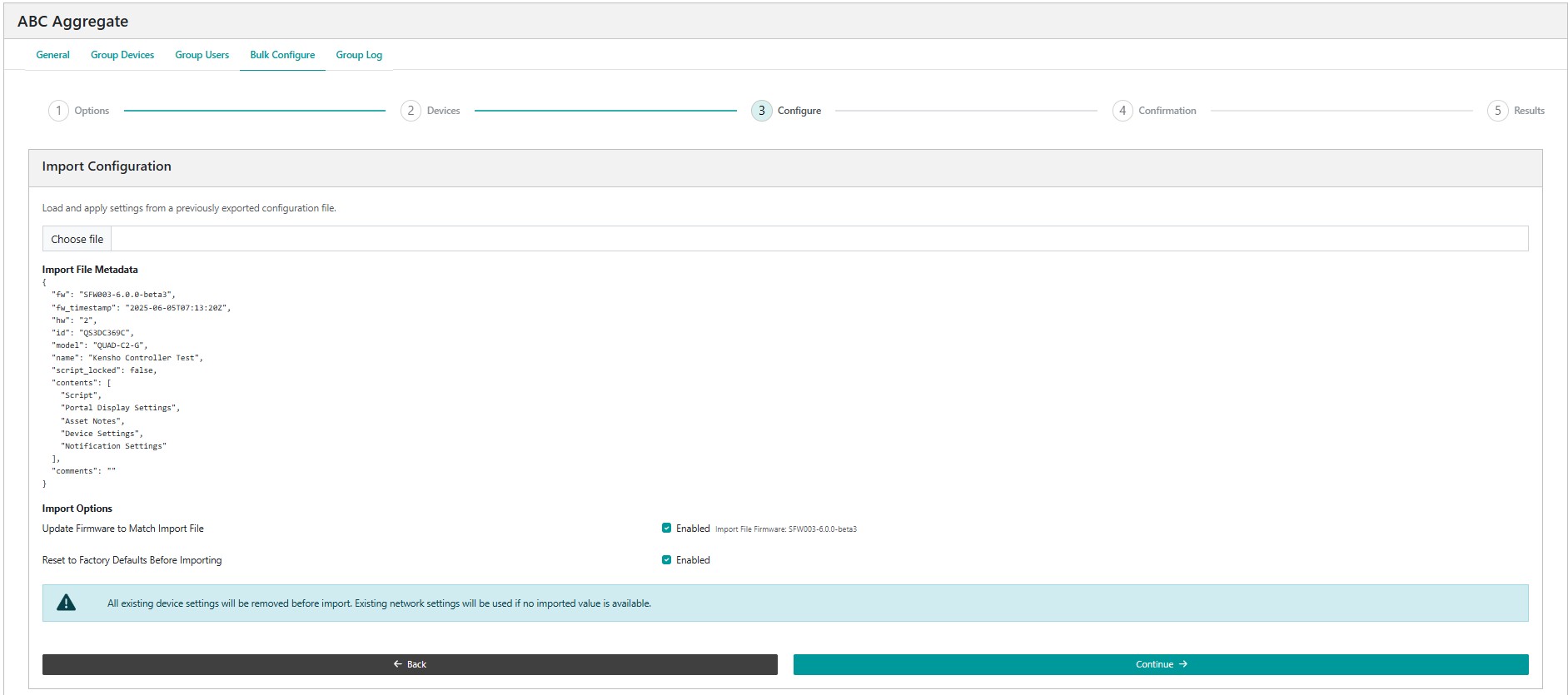
Device configuration files contain device settings, scripts, Senquip Portal display settings, asset notes, notification settings, and API settings. The Bulk Configuration Import feature allows configuration files that have been exported from a device to be imported into multiple devices at once.
Access this feature from the Group Settings > Bulk Configuration Options menu by selecting the Import Configuration option.
After selecting a previously exported configuration file, you have the option to
Update Firmware to Match Import File - update the device firmware before importing the configuration file
Reset to Factory Defaults Before Importing - removes all setting from the device before applying the settings in the configuration file
Note
Configuration files only contain settings that are different to the defaults. If other settings have previously been changed on the device, these will not be affected by the import. It is therefore suggested that devices be returned to factory default before a configuration is imported.
Note
If the imported configuration file does not contain network settings, the device will retain existing network settings.
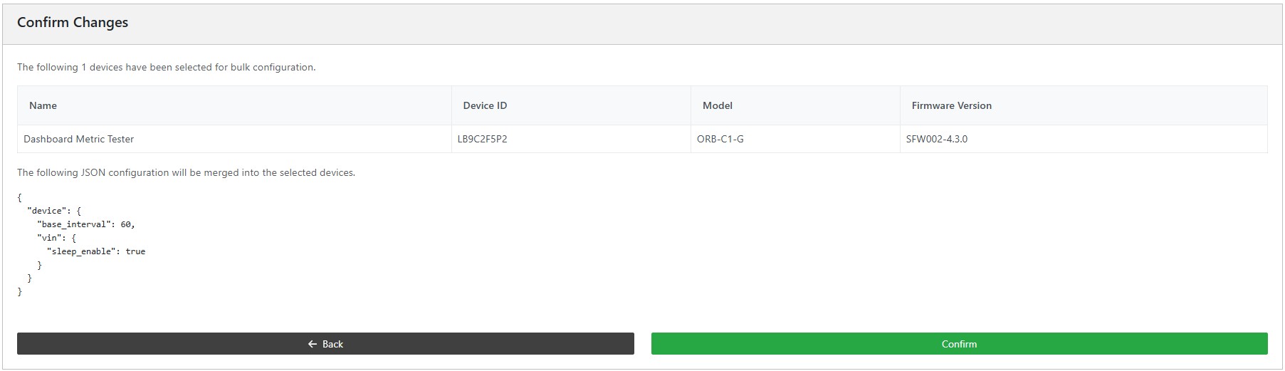
After a user confirmation, the results of the bulk configuration import are shown.
Warning
If the configuration file originates from a different firmware, for example SFW002 from an ORB being applied to SFW003 on a QUAD, device settings may not be compatible.
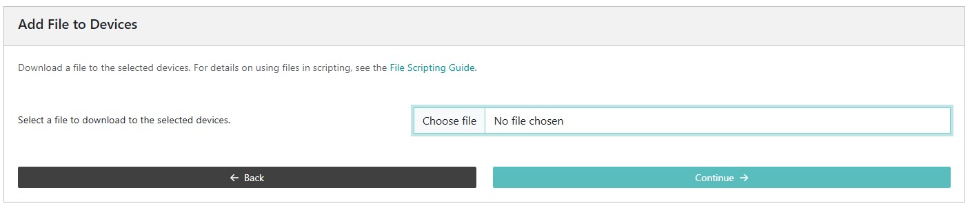
User files, typically csv or txt, can be uploaded to multiple devices at the same time. These files may be used in scripts to linearise sensors, update geofences, or a host of other applications.
After choosing a file, the results of the file upload are shown.
Senquip Vision is a powerful, customisable dashboard that enables businesses to monitor and analyse key operational metrics across a group of devices. Designed for management, maintenance and operational users, it provides a clear and intuitive interface for tracking real-time data, historical trends, and device status, all in one place.
The following are key elements of a Senquip Vision Dashboard:
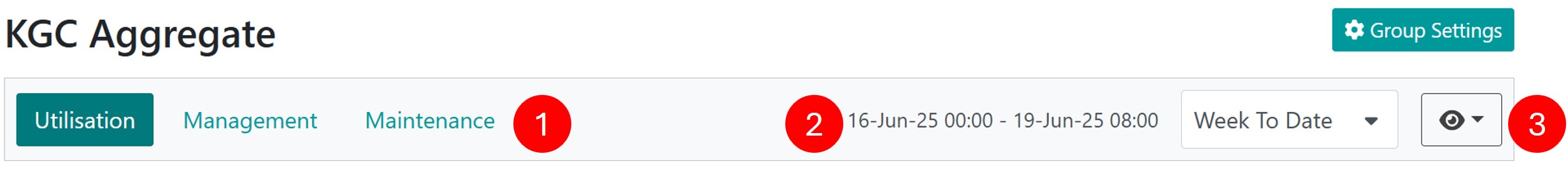
When a new Group is created, a default display with table and map will be generated. Users can then create different views for management, operational, maintenance and other functions. Headline numbers, a customised table, charts, and a map can be added to a view.
A period of interest can be selected that aligns with the function of the view. For example, when considering rainfall data, month to date may be the most meaningful period. When considering productivity, the last 7 days may be more useful.
When a period is selected, calculations on data (metrics) are performed over that time, and data is displayed for that period.
Available periods are shown in the table below. Additional periods and previous periods can be selected using the Custom Range option.
Period
Description
Last 24 hours
Rolling window of 24 hours
Last 7 days
Rolling window of 7 days
Last 30 days
Rolling window of 30 days
Week to date
Fixed 7-day period, staring at 00:00 on Monday
Month to date
Fixed period staring on the 1st of the month at 00:00
Metrics refer to data measured by a device, or values derived from that data by applying operations such as average, total, difference, and others. Metrics are shown in the summary table, on charts, and are the basis for headline numbers. Available metrics include latest data, minimum, maximum, total, difference, accumulation, and time weighed average. Metrics are selected for a measurement when columns are added to the summary table.
Min, max, average, total, difference, and latest metrics are available
Metrics are calculated at the end of each hour for the data collected in that hour and are then collated for the selected period.
Maximum and Minimum
The highest and lowest value measured over the selected period.
Example applications:
lowest temperature in the last 24 hours
Lowest tank level so far this month
Highest engine temperature this week
Highest engine RPM over the past 24 hours
Note
If no samples are available in the period, this value is undefined.
Note
If only one sample is available in the period, the minimum and maximum are the same.
Note
Maximum and minimum up till the end of the last complete hour.
Latest Data
The latest value measured by the device.
Example applications:
Current engine hours
Current tank level
Current temperature
Current machine state
Note
If there is no current data, then the last available data will be displayed.
Time Weighted Average
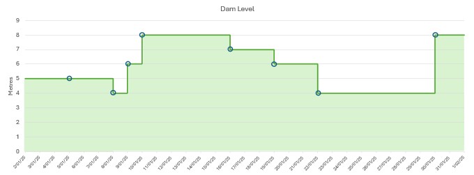
The time weighted average considers how long each value was applicable when calculating the average. If for instance, only a few samples are taken in a day, the Time Weighted Average will assume that the previous sample was valid until a new one arrives. This ensures that values occurring for longer durations contribute proportionally more to the average.
In the example below, a dam level is monitored. Actual level samples arrive sporadically. In the absence of a sample, the previous sample is assumed to still be valid. The time weighted average will be the area under the chart divided by the period. Notice that the first sample is 2-Jan-2025 0:00:00 which represents midnight on the 1st Jan. Likewise, the last point is the 1-Feb-2025 0:00:00 which represents midnight on the 31st Jan.
Time weighted average works well where there are missing samples
Example applications:
Average dam level over a month
Average flow over a month
Note
If there is no previous data at the start of the period, the last sample from the previous period will be used.
Note
If there is no previous sample, then the first sample will be assumed to have been the value at the beginning of the period.
Integration
The integration function estimates the area under a time-varying signal curve over a measurement period. It is used to calculate the effect or quantity of a signal that represents a rate over time.
For example, a flow meter that outputs a 4 to 20 mA signal proportional to flow rate can be integrated to estimate the total volume.
Internally, integration is performed by multiplying each sampled value by the time between samples (in seconds), using the same technique as the time weighted average.
Note
The input signal should represent a rate per second (e.g., litres per second), so that the integrated result is in consistent physical units (e.g., litres or joules).
If your sensor reports in units per minute, you must convert to per second (e.g., divide by 60) either in the sensor settings or using a script.
Note
The Integration function follows the same sampling approach as shown in the TWA diagram, but it does not divide by time.
Warning
Integration accumulates small errors over time.
Total Over a Period
Calculates the total of all the measured samples over a period. In the figure below, daily rainfall is totalised for the month. Notice that the first sample is 2-Jan-2025 0:00:00 which represents midnight on the 1st Jan. Likewise, the last point is the 1-Feb-2025 0:00:00 which represents midnight on the 31st Jan.
Number of times that the pressure has dropped below a threshold.
How many times a gate has been opened.
Creating a metric to process totals based on historic data simplifies device configuration by offloading totalisation over a period function from the device to the Senquip Portal.
Note
If no samples are available in the period, this value is zero.
Note
The sum over a period is calculated up to the end of the last complete hour.
Difference Over a Period
The difference between the most recent data and the same data at the end of the previous period.
Example of use:
Change in dam level over the past month
Change in engine hours over the past week
Change in idle hours over the last 7 days
Note
If no samples are available in the period, this value is undefined.
Note
If no samples are available in the previous period, this value is undefined.
Note
The difference over a period is calculated up to the end of the last complete hour.
Accumulation Over a Period
Calculates the total increase in a parameter over the selected period, regardless as to whether the source parameter is reset. For instance, if an engine hour meter is replaced or reset, and returns to zero, the accumulation will not be reset and will continue to climb. In the figure below, engine hours are being read from an hour meter. As the hour meter rises, so does the accumulation. When the hour meter is reset, the accumulation does not change and continues to climb. Accumulation is a good measure of a total where the source data may reset.
Accumulation calculates increase even is the source parameter is zeroed
Example:
Engine run time where the engine hour meter may be replaced
Engine idle time where the counter resets to zero when the engine is powered off
Total distance travelled based on a trip distance meter
Total flow where the flow meter may get zeroed
Note
If no samples are available in the period, the value will remain the same as end of the previous period.
Note
If no samples are available in the previous period, the start value will be assumed to be zero.
Note
The accumulation over a period is calculated up to the end of the last complete hour.
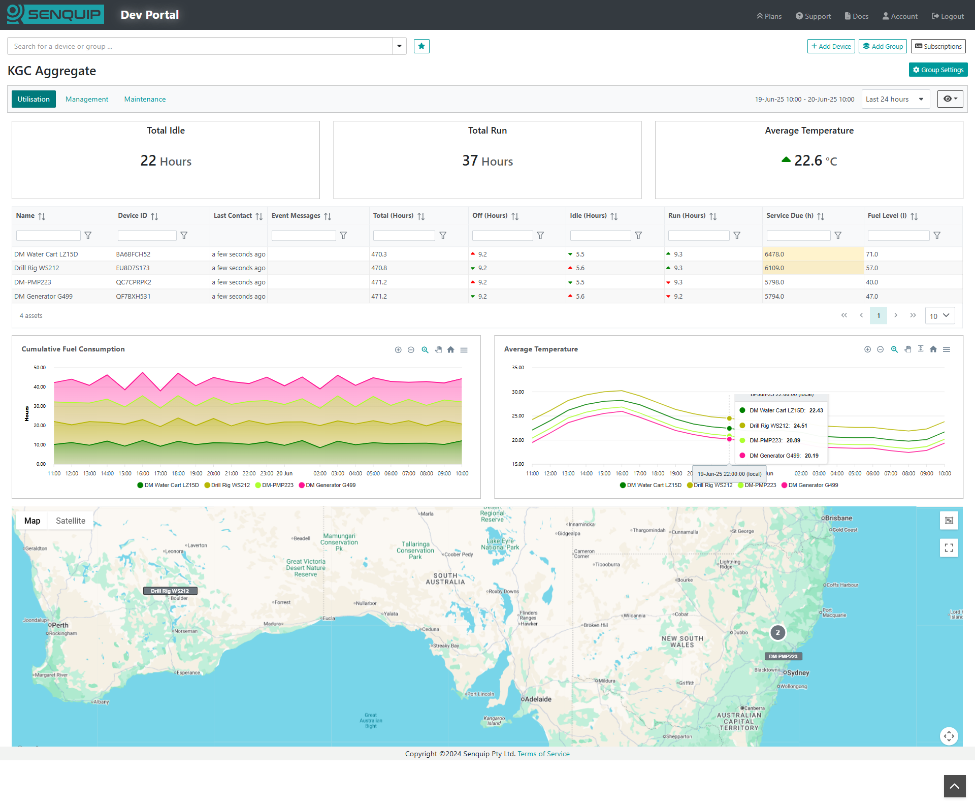
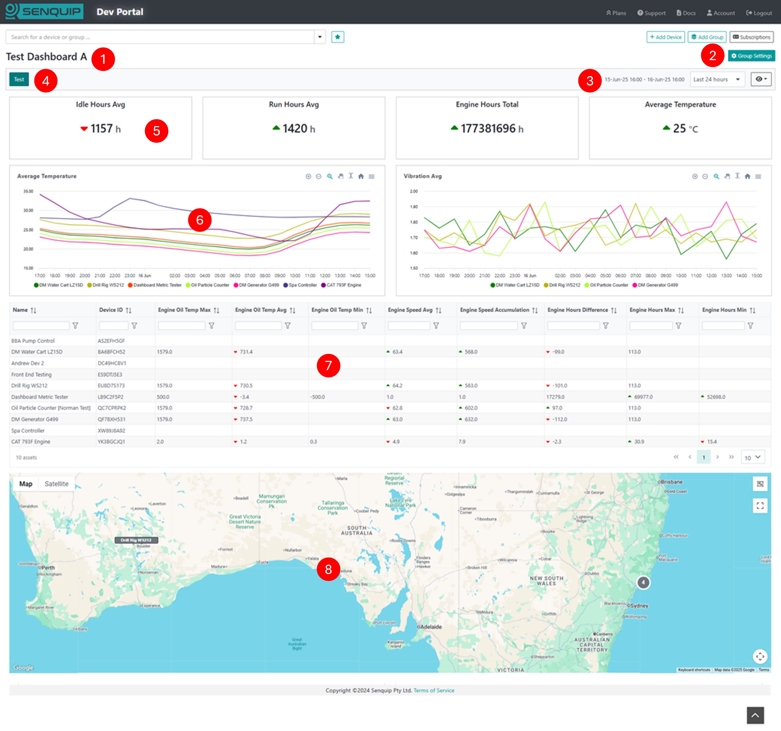
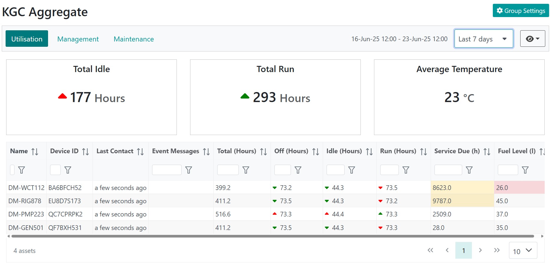
The summary table widget is the primary element on a view. It shows metrics over the period for all devices in a view. In the example below, we see that fuel is low on some machines, indicated by the cells being marked red. On 2 machines, the fuel is very low, and alert messages are active. Idle hours when compared with the previous period are down on three machines as marked by the green down arrows. Run hours on 3 machines are up, a good outcome.
Click a device in the table to inspect the device data page.
Device summary table showing alarms on the fuel level
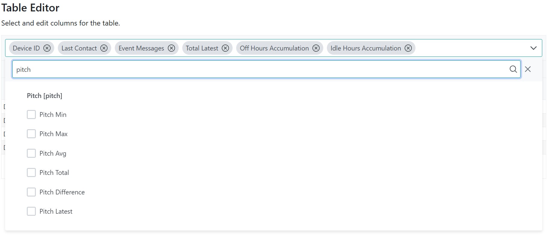
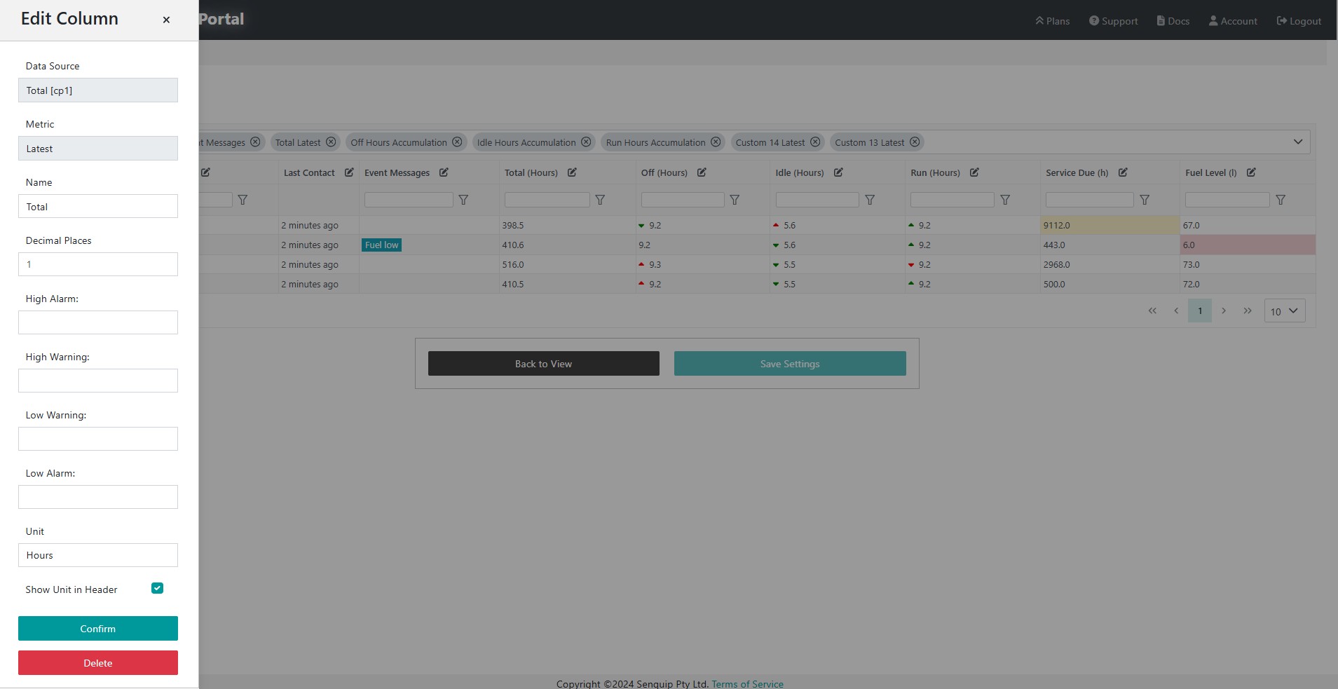
Columns are added, removed, and edited using the table editor. In the example below, metrics have been filtered by temp, and the minimum, and average temperature have been chosen to be added to the summary table.
The features of table columns can be changed by pressing the edit button at the top of each column in the table editor. Warning and alarm levels can be applied, which when selected will change the cell colour to orange or red. Red and green indicator arrows can be enabled in each cell to show whether a value has increased or decreased when compared to the previous period.
Press the edit button on each column to edit functionality
In this example summary table, a warning has been placed when engine hours increase above 6000, and an alarm has been placed on low fuel. Indicator arrows are indicating that idle are down on 3 machines, and run hours are up in most cases.
Example Device Summary Table showing warnings and alarms
Filters
Filters are used to single out devices from all the devices in the group. Permanent filters can be applied in the table editor, or temporary filters can be applied in the live view. For example, a group may be created that contains all the off-highway assets at a quarry. Different views can then be created to show lighting towers, pumps, and crushers by adding a filters on asset type in the table associated with each view.
Warning
Remember to save your settings before returning to the view.
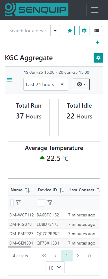
Headline numbers show data based on all devices in the current view. In the example below, total idle hours and total run hours across the 4 devices in the table are shown as headline numbers. We can immediately see that idle hours are up over the last 7 days when compared to the previous period, the good news is that run hours are also up. Increased idle hours are bad and are marked with a red up arrow. Increased run hours are good and are marked with a green up arrow. Hover on the arrow to see the value for the previous period.
Headline numbers show metrics across all devices in the view
Headline numbers are added using the Edit View button by selecting Add headline. Headline numbers perform operations on all devices in the view. Available operators are:
Total: Sum a metric across all devices in the view
Average: Calculate the average across a metric, for all devices in the view
Minimum: Show the minimum value ascoss all devices in the view
Maximum: Show the maximum value ascoss all devices in the view
When creating a headline the following steps must be taken:
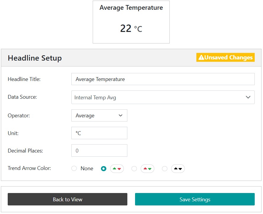
Select the data source from all available metrics. In the example below, the data source chosen is Internal Temperature Average.
Choose the operator from either total or average. In the example below, average is chosen and so the headline number will show the average of all the internal temperatures across all devices in the view.
Chose a meaningful title, a unit, the number of decimal places to show
Select a trend arrow, if required, being careful to chose whether up and down are good or bad
Headline numbers total and average a source metric across all devices in the view
Warning
Remember to save your settings before returning to the view.
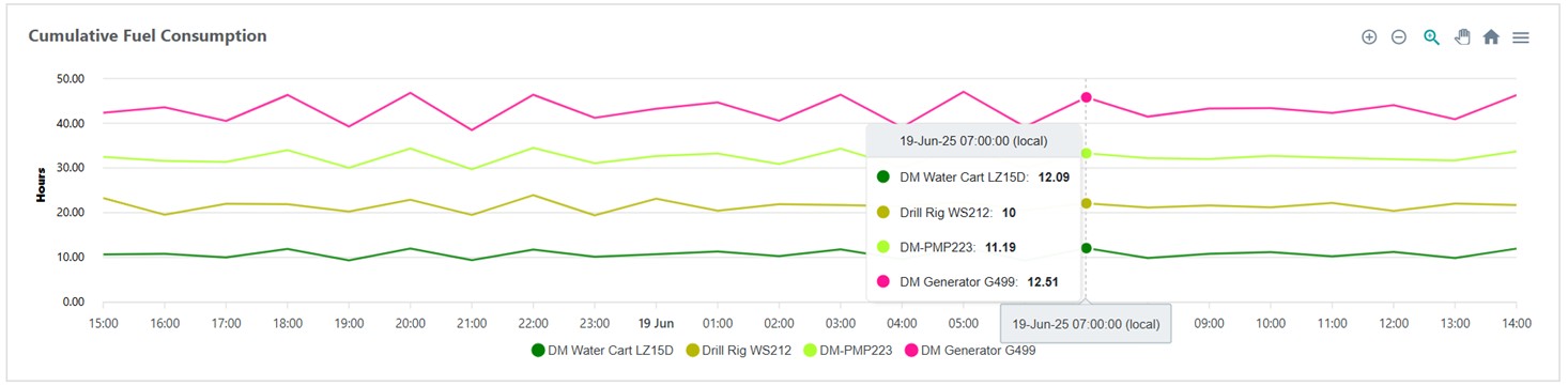
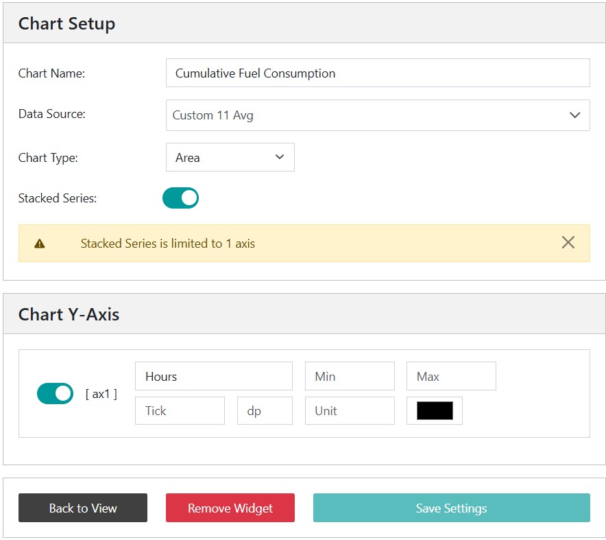
Charts can be added to show trend data across the period of interest. Charts show metrics as calculated at the end of each hour. In the example below, a stacked line chart is used to show total fuel used across all machines by the hour. It can been seen that the water cart used 12.09 litres of fuel for the hour ending at 07h00.
Charts are added using the Edit View button and selecting Add Chart. When creating a chart, the following steps must be taken:
Select the data source from all available metrics. In the example below, the data source chosen is the average of Custom 11. In this case, Custom 11 is a custom parameter that has been generated in a script on a device and measures instantaneous fuel consumption.
Choose the chart type as either line or area, and select whether it is stacked.
Chose a meaningful chart name and configure the y-axis.
A stacked chart shows cumulative contribution of multiple data series over time
Warning
Remember to save your settings before returning to the view.
A map will be added to the view by default; it can be removed using the options activated by pressing the Edit View button and then selecting Edit Widgets and pressing the delete icon on the map. Once removed, an option to add it will appear in the Edit View options.
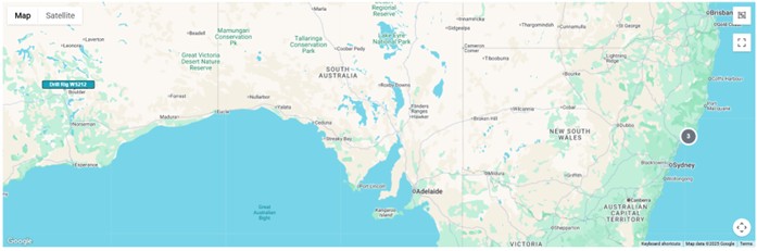
Clusters of device seperate as the zoom level increases
Where the are many devices in the same area, they will cluster and be shown as the total number of devices in that area. As the zoom level is increased, the devices will separate.
The colour of the labels on the map indicates if there are any current alerts associated with the device.
Grey: No alerts
Blue: Alerts
Orange: Warnings
Red: Alarms
Click a device on the map to inspect the device data page.
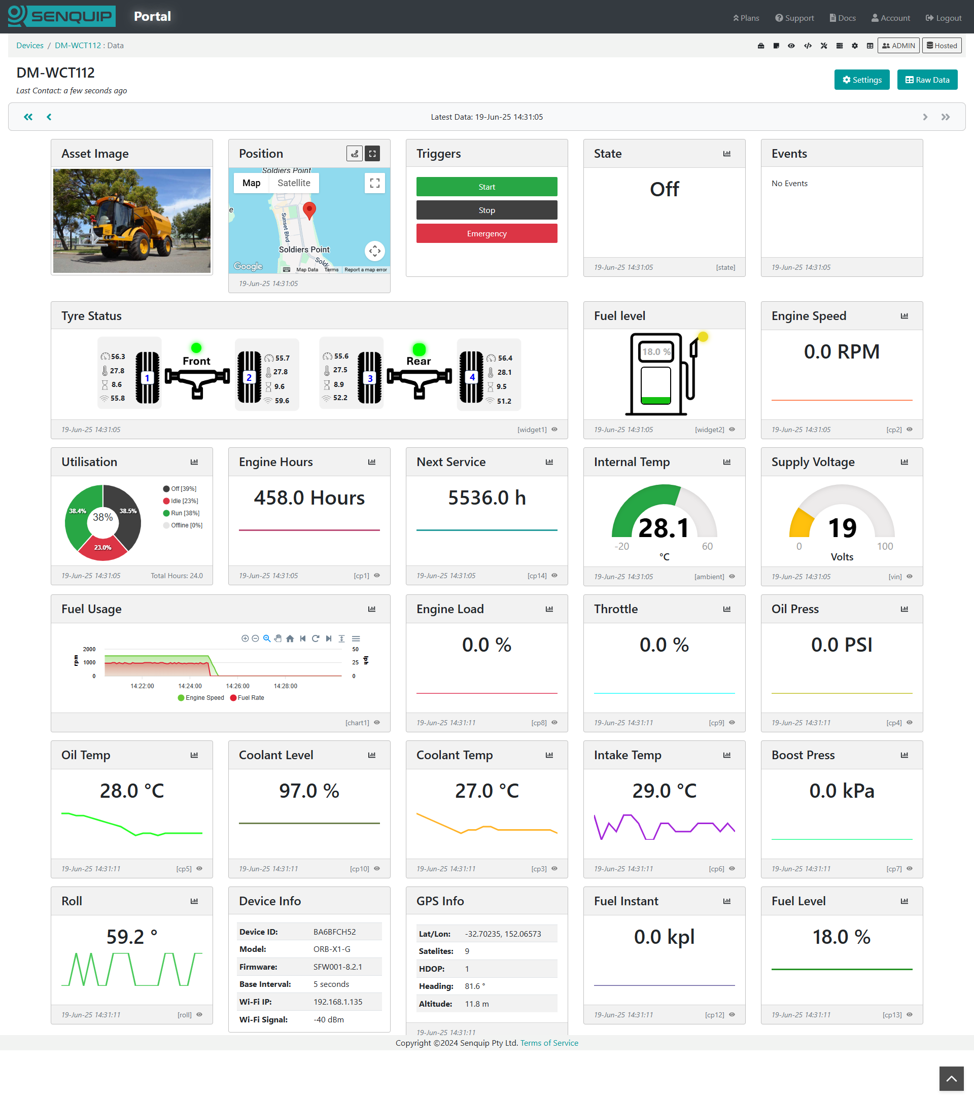
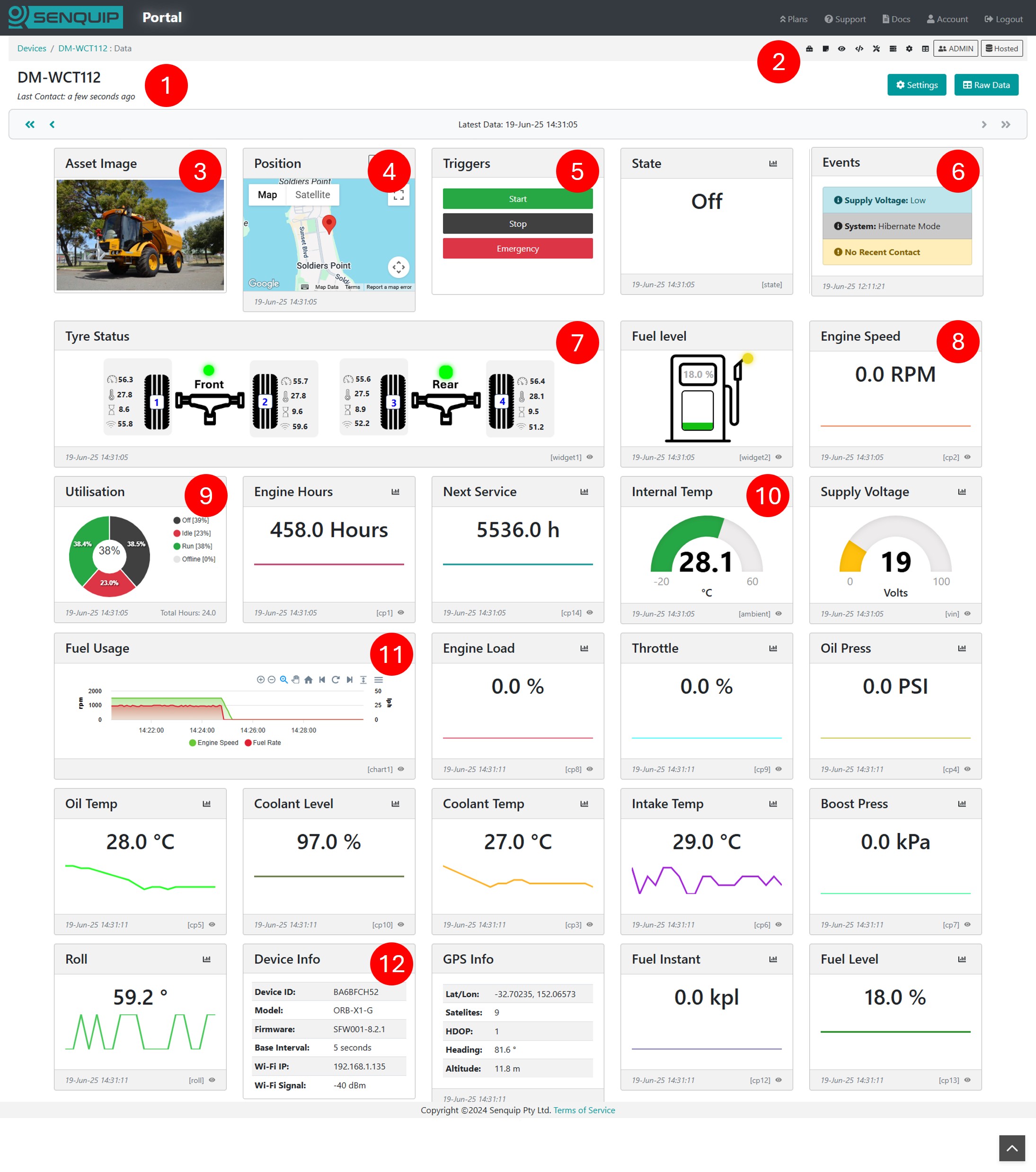
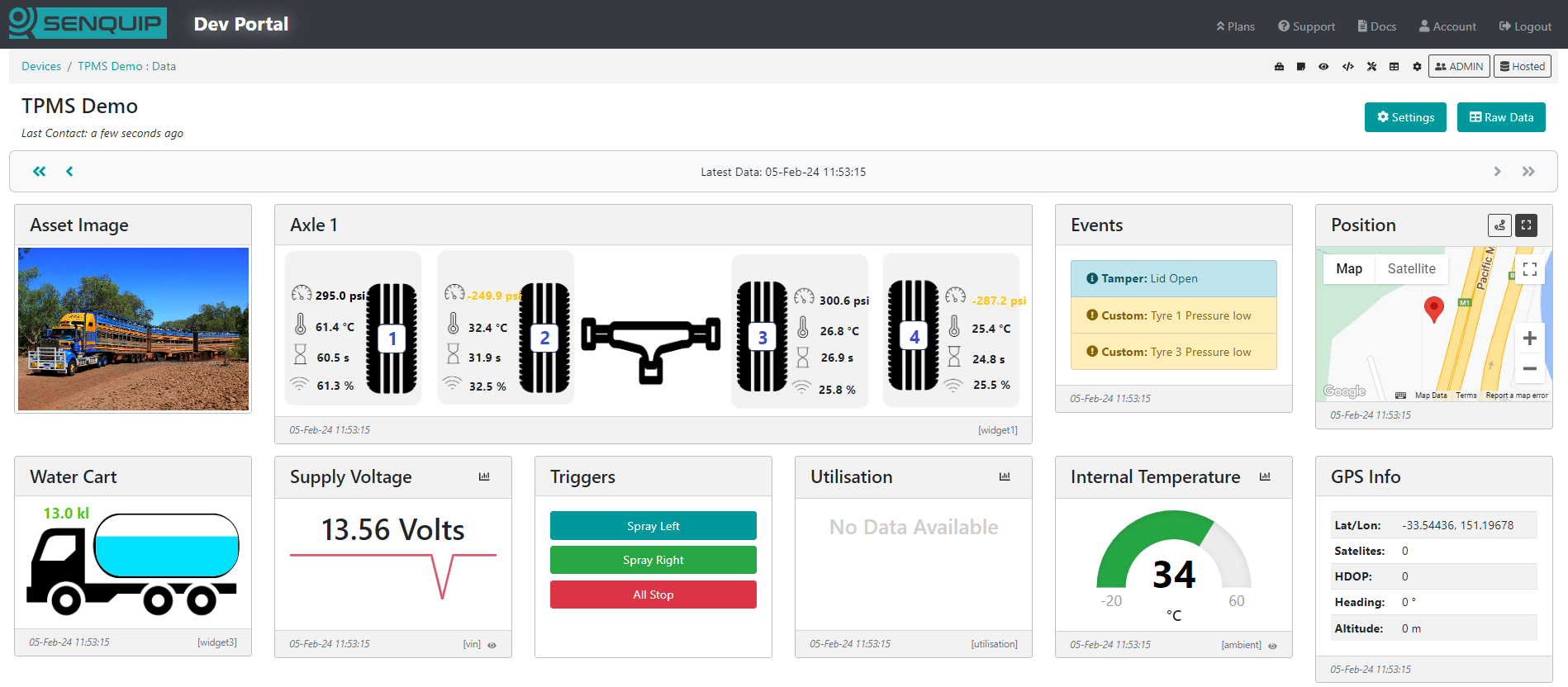
The Device Data Page offers a centralised and intuitive view of all real-time and historical measurements reported by a Senquip device. Data is shown in real time and can be visualised as numbers, gauges, charts, or infographics.
The following are key elements of the Device Data Page:
Device Data Pages provide a detailed view of measured data
Key
Element
Description
1
Device Name
The name associated with the Senquip device
2
Toolbar Icons
Provide quick access to device settings, scripting, raw data, and more
3
Asset Image
Optional application image
4
Map
Shows the current device location and historic track
5
Trigger Buttons
Allow for remove control by activating functions locally on a remote device
6
Events
Shows all active alerts, warnings, and alarms for a device
7
Infographic
User generated graphical widget that allows information to be shown in a meaningful way
8
Number
Widget displaying numerical data as a number
9
Utilisation
Pie chart showing asset utilisation
10
Gauge
Numerical data shown as a gauge
11
Chart
User generated chart showing trend data
12
Device Info
Shows information about the device
13
Raw Data
(Not shown) The raw JSON data for a device
The Device Data Page is also the central hub for managing device setup. From the toolbar icons on the page, you can select the following:
Asset Notes: Add notes and images associated with the device application and install.
Display Settings: Choose which measurements are displayed, and the order in which they are displayed. Create custom Graphical Widgets and Charts.
Scripting: Link to the device scripting page to customise device operation, create custom parameters, add trigger buttons, and configure states.
Diagnostics: View device diagnostics information, SIM information, signal strength and more.
Server Log: Show a log of all user activity including when settings were changed, and when users were added.
Settings: Change device settings, perform firmware upgrades, and configure events.
Raw Data: Download historical data and export to CSV if required.
Note
Available options will vary depending on user permissions.
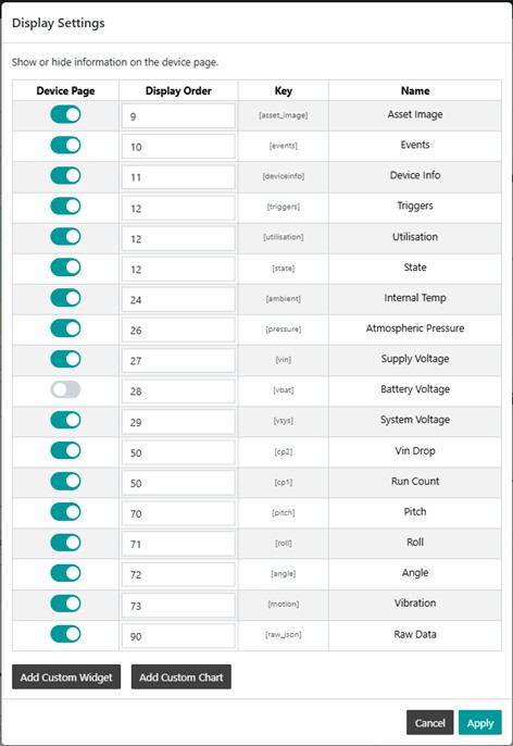
As measurements are enabled on the Senquip device, associated widgets will automatically appear on the Device Data Page. The widgets can be turned on and off, and the order of display can be changed.
Page Layout
Select the Display Settings icon to choose which measurements are displayed, and the order in which they are presented.
Turn widgets on and off and configure the display order
Add Asset Image and Logo
Select the Asset Notes icon to upload an image of the asset being monitored, a brand logo, the install location, and to make notes about the install.
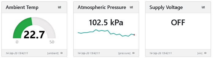
Change Widget Display Format
Press the eye icon at the bottom right of the widget to switch between various display formats. Available formats are:
Hidden - Hide the data if it is not relevant to the application
Trendline - The default graph that facilitates recognition of change. Allows the user to view longer term trends between date ranges.
Gauge - Useful when representing measurements that must exist within a range. Can be scaled so that the pointer is vertical under normal conditions. Warning and alarm levels can be set.
Digital - A simple ON or OFF display that shows the status of a measurement. The threshold at which the display switches from ON to OFF can be set.
Switch between numberic, gauge, and digital display modes
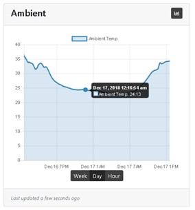
Click on the icon at the top right of each widget to show numerical data on a chart over a selected period. Click on a point on the chart to show values at that point.
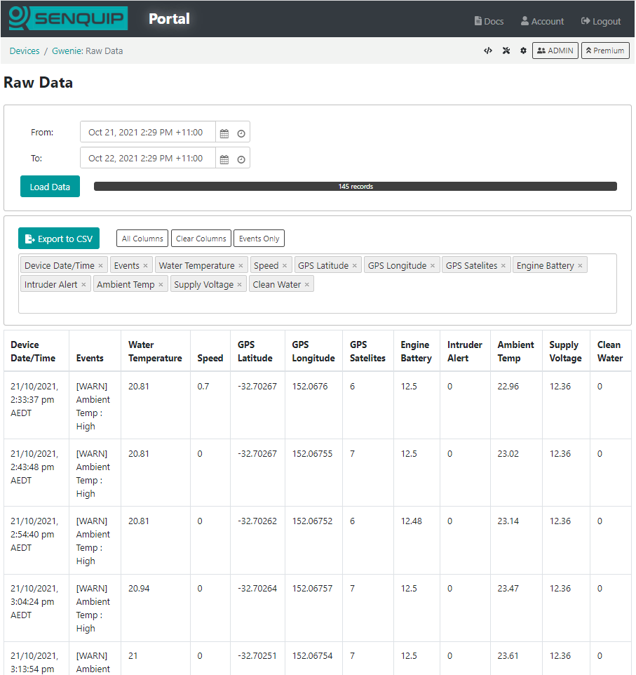
To view or download historical data, press the Raw Data button on the top right of the dashboard. A table showing all the data associated with the selected device will be shown. To download the data, press the Export to CSV button. The data will be saved to your downloads folder. The downloaded file can be opened and manipulated with any spreadsheet tool.
Data associated with the selected device shown in a table
Note
The timestamp in the timestamp column is in Unix Time; if you would like a GMT date and time field, enable the timestamp setting in endpoint settings.
In addition to group-level user permissions, permissions can also be managed at the individual device level. This is particularly useful when a user needs access to configure or manage a specific device without being granted administrator rights across the entire group.
To adjust device specific permissions, navigate to the device data page and click the User button. From there, you can assign or modify access for individual users as required.
Warning
Anyone who has the device ID and setup password can add the device to their account with Admin permissions.
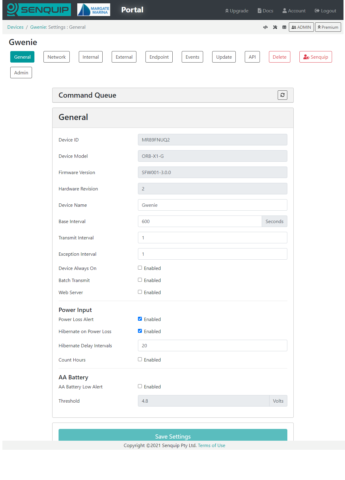
Settings associated with a Senquip device can be updated remotely via the Senquip Portal. To change the settings for a selected device, press the Settings button on the top right of the dashboard. The selected device settings will be shown and can be changed by clicking in the relevant fields. Once a setting has been changed, press the Save Settings button at the bottom of the page.
Senquip devices check for settings changes each time they make a connection to the Senquip Portal. If a device is set to transmit data once an hour, then the settings will be changed up to an hour after the changes have been made on the portal. If quicker changes are required, the device will need to be visited and the changes made via the integrated webserver in setup mode.
Remote update of device settings via the Senquip Portal
Note
In applications where power is available, a quicker transmit interval will mean that settings changes can be made more quickly.
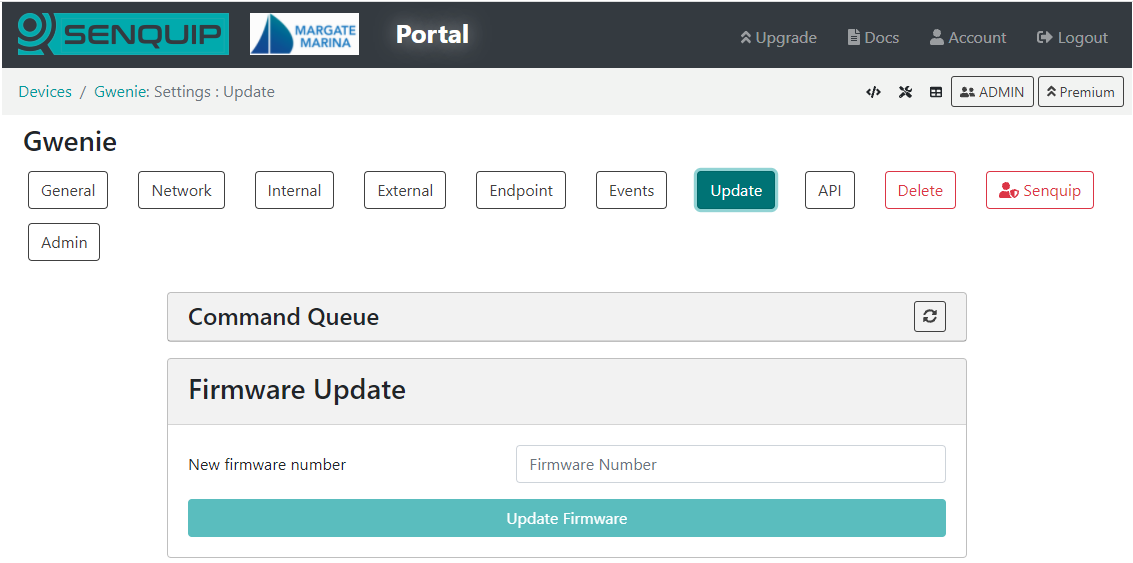
Senquip will routinely make firmware updates to enable new features, enhance security and fix bugs.
Device firmware can be updated via the Senquip Portal. To update the firmware, press the Update button on the settings page. You will be directed to a page asking for the firmware number. This number can be found in the Device Firmware Changelist on the Senquip website or through your preferred distributor.
A Firmware Update typically takes about 5 minutes on Wi-Fi and 20 minutes on 4G LTE. During the update the green light will be off and the orange light will flash fast. Once the device has received the firmware update and is processing it, the lights may appear to freeze. This is normal behaviour. Please allow plenty of time for the device to finish the update and return to normal operation.
Note
There is always a risk that something may go wrong during a firmware update; it is not recommended that firmware be updated unless it is suggested by Senquip or a specific new feature is required.
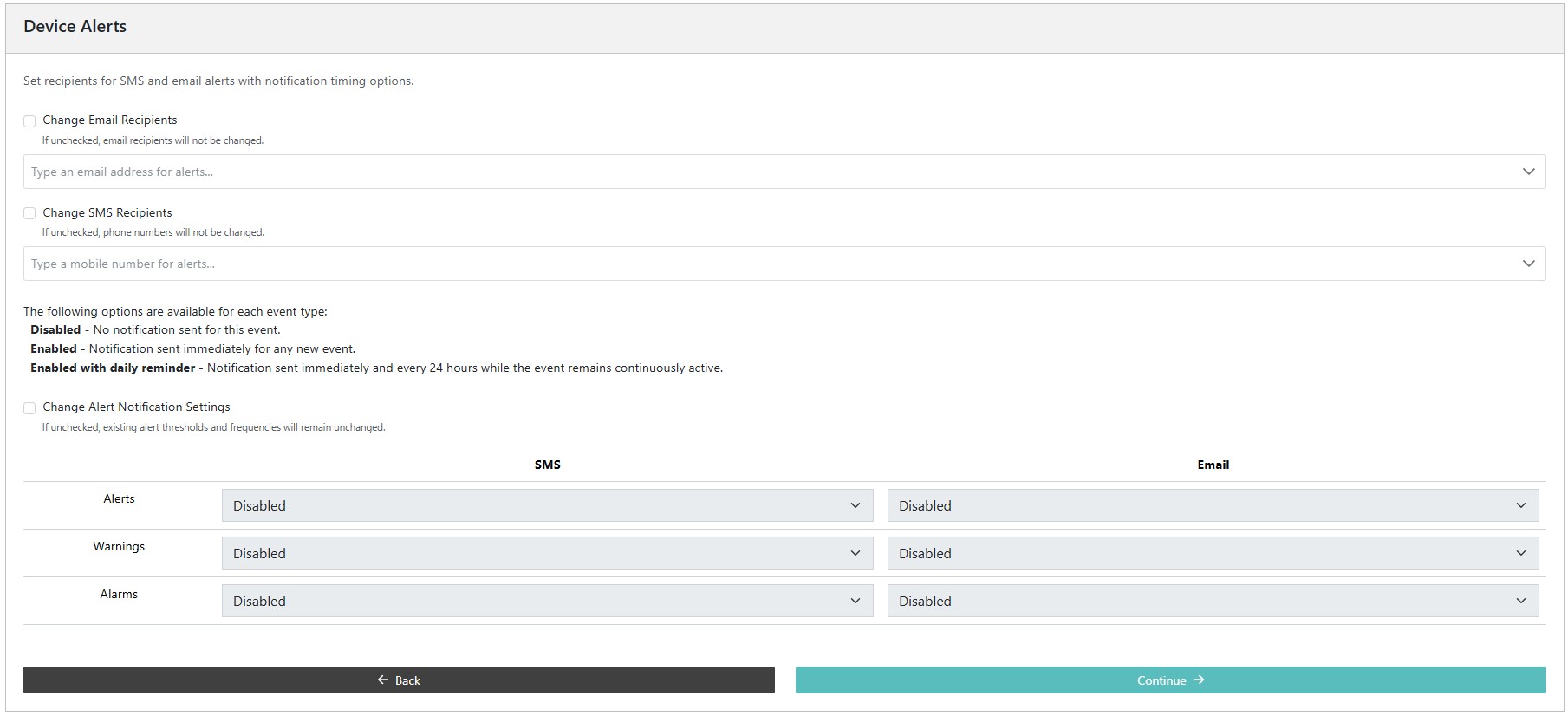
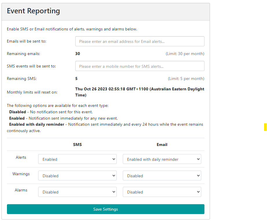
The Senquip Portal allows forwarding of alert, warning, and alarm events generated on a device to email or SMS endpoints. A Hosted plan is required for this feature. Use the Events page on the Senquip Portal to configure event reporting. Events can be configured to be sent once as they occur, or with a daily reminder.
Warning
Make sure to add no-reply@senquip.com to your safe senders list on you email client to prevent email events from going into spam or junk folders.
If an event is current, and the event escalates, for example a warning turns into an alarm, the more severe event will be forwarded. If an event is current and it de-escalates, for an example, an alarm turns into a warning, the event will not be forwarded. If a type of event is current, and a new type of event occurs, the new event will be forwarded. For instance, if a high current warning is active and has been forwarded to email or SMS, and a high temperature warning becomes active, the high temperature warning will also be forwarded.
When a device reconnects and sends buffered data, the following rules apply:
If newer data has already been received, older buffered data is processed but no alerts are sent.
If no newer data exists, alerts are only sent for buffered data that is less than 12 hours old.
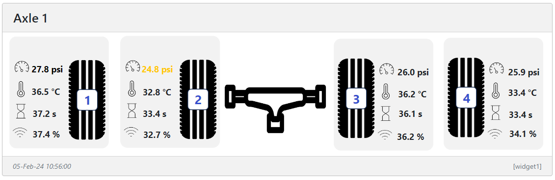
Users can create custom widgets that display data graphically in a way that is meaningful to the user. In the example below, the pressure and temperature of each tire on an axle is shown. In the example, the pressure on tyre 2 has dropped and so the pressure field has turned yellow as a warning to the user.
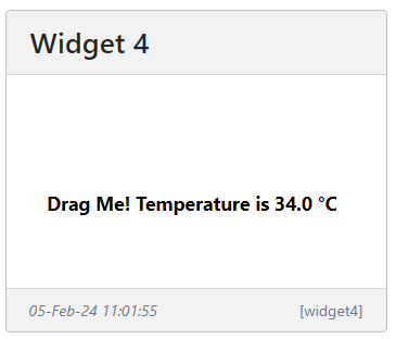
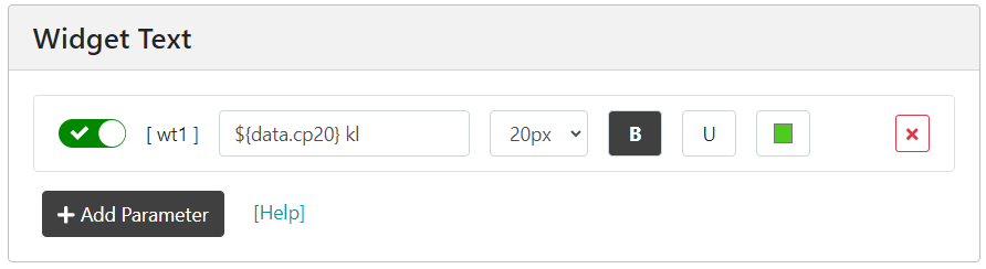
To create a widget, select the Display Settings icon on the device data page and chose Add Custom Widget at the bottom left of the page. A new custom widget will be generated and you will be taken to the Widget Editor page to customise your widget. At the top of the Widget Editor page is your widget. It will default to a blank background with an example of how to display temperature shown. The text can be moved to a new location by clicking on it and dragging it.
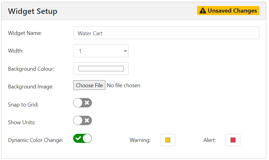
As an example, we will generate a widget that shows the level of water in a water cart. In the Widget Setup window, we get to name our widget with something meaningful to the user. We will name our widget “Water Cart” We can also set the width of the widget in units of a standard Senquip Portal widget. We will leave the width as 1 unit wide. A background colour can be selected and a background image loaded. We will use the Choose File option to load a background image of a water cart. We can choose to show the units associated with values displayed on our widget, or to leave the units off and make the units part of the background image of the text that is displayed along with the value. We will turn off showing units. Selecting Dynamic Colour Change automatically changes the colour of values and associated text when a warning or alarm is associated with that value. We will leave this on.
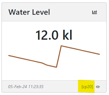
The Widget Text window allows us to insert text and values on the image in the widget. When you created your widget, an example text entry was created “Drag Me! Temperature is ${data.ambient}”. In this example, the text “Drag Me! Temperature is” will be displayed along with the value of the ambient temperature. The most recent value of ambient temperature is inserted in the text string by using a dollar and curly bracket, followed by the data element, in this example ambient temperature, and a closing bracket “${data.ambient}”. In our example, we will create a script that has a custom variable cp20 called Water Level, and will use this in our example, inserting the unit kl in text as follows “${data.cp20} kl”.
Because we have chosen Dynamic Colour Change, the colour of the text will change if there is a warning or alarm current on cp20.
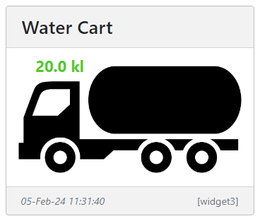
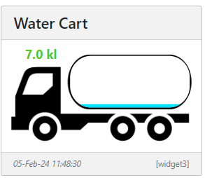
Our widget now looks like the image below.
Water cart widget with water level shown in green.
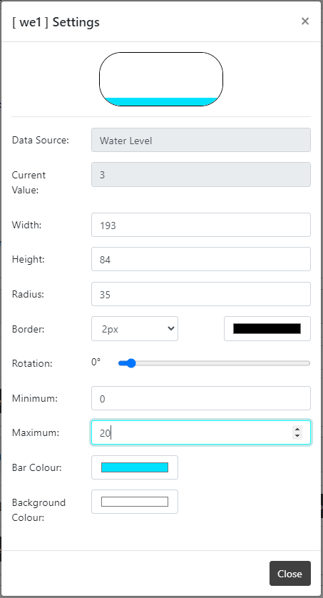
We will now use the Widget Elements window to add a dynamic level indicator to the tank on the water truck. We will associate the level indicator with the water level, cp20, and will set the width, height, and radius to match that of the tank on the water truck image. Since the water level parameter created in the script has a range of 0 to 20, we will set the minimum and maximum levels of the indicator to 0 and 20.
We could also add a status indicator light to the image by adding a status indicator element. Status indicators can be associated with data values and can be set to change colour as the data value drops below a threshold.
To edit the widget, go to the Display Settings page and select the widget by clicking on the widget name.
Sizing of widget images
The width of a custom widget can be chosen as 1 to 4 standard widgets in width. The height of the widget is determined by the size of the image uploaded. In the water cart example above, the image was scaled to result in a widget that is the same height as most of the other standard widgets on the device page. This makes for a neat and consistent looking display. To create a widget the same height as most widgets on the Senquip Portal, use the following ratios for the background image.
Note
The image does not have to be these exact sizes as the width will auto scale. The ratio does however need to be correct.
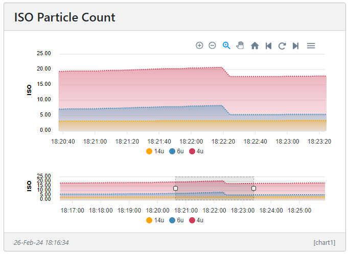
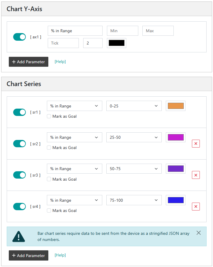
Users can create custom line, area, and bar charts with multiple axis, and multiple series. In the example below, the number of particles of a particular size in oil is shown on a stacked area chart, with the total of the stack indicating the total number of particles.
To speed up render time, all charts are downsampled to show 1000 points across the chart. The algorithm used to downsample the chart data has been selected to retain as many of the features of the original data as possible. It is however possible that details may be missed in a highly compressed timeline.
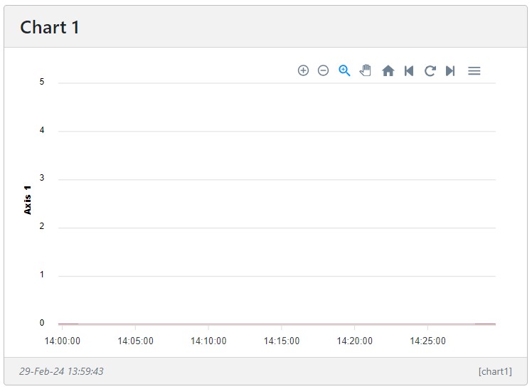
To create a custom chart, select the Display Settings icon on the device data page and chose Add Custom Chart at the bottom left of the page. A new custom chart will be generated and you will be taken to the Chart Editor page to customise your chart. At the top of the Chart Editor page is your custom chart. It will default to a simple chart with no series.
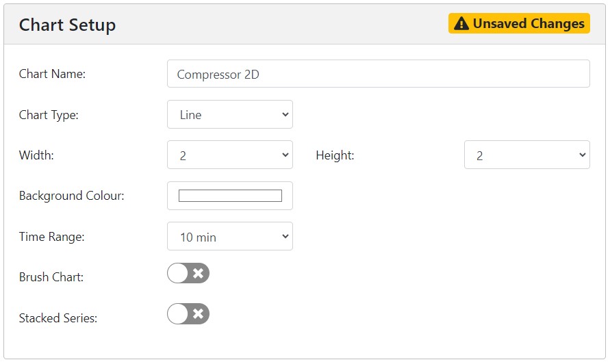
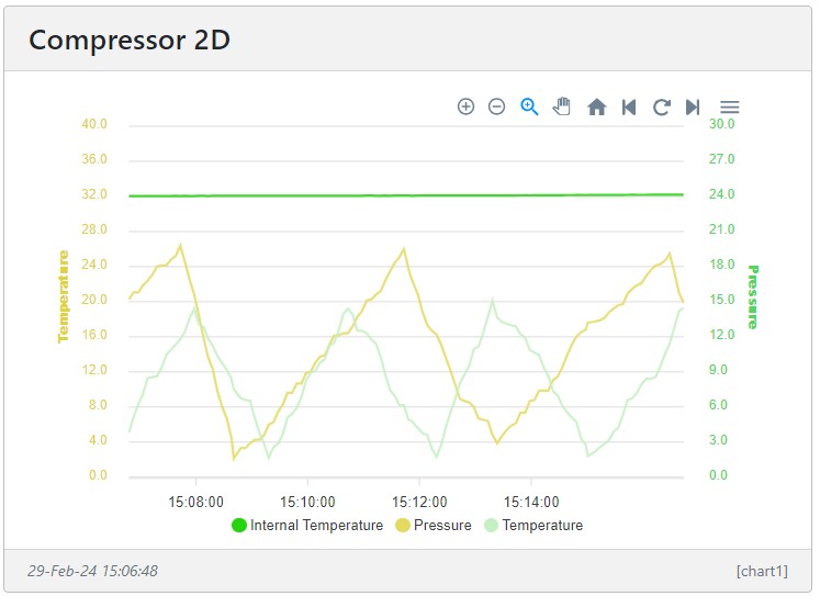
We start by giving the chart a name, in this example, we will generate a chart showing temperature and pressure in a compressor and so we will call the chart “Compressor 2D”. We will choose a Line chart, and will give the chart a size of 2 widgets wide by 2 widgets high. We have chosen a time range of 10 minutes. If we had selected Brushed Chart, a magnifying window below the chart would appear that can be dragged left and right to scroll through chart data. The earlier oil particle chart is an example of a brushed chart. If we had selected a Stacked Series, the values of the various series would be summed. The example of the oil particle chart is a stacked chart.
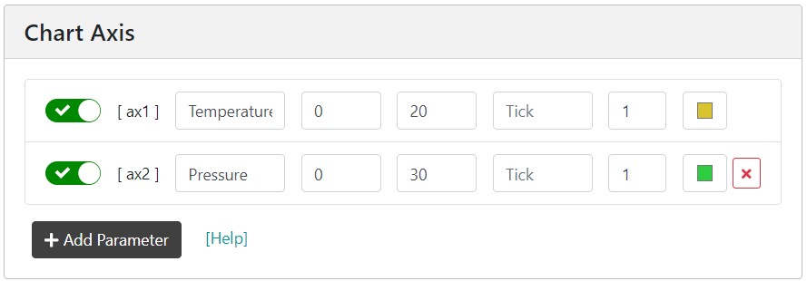
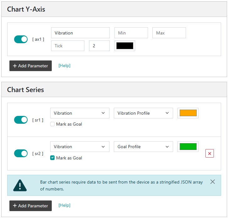
We will now add the axis to the chart. We add 1 axis for temperature and 1 axis for pressure. We have added custom minimum and maximum values for the axis but if we had left them blank, axis values would have been assigned based on the available data. The tick interval has been left blank and will be calculated automatically. One decimal place has been selected for the axis labels, and a colour has been assigned to each axis. Custom axis settings are disabled if the Brush Chart option is selected. Only a single axis can be added if Stacked Series is selected.
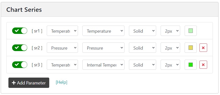
We will now create a series and will assign an axis to each series. We first select the axis associated with the series. We then select a measurement. In our example, we will add compressor temperature and internal device temperature to the Temperature axis and pressure to the Pressure axis. We have selected the line type as Solid, have selected a line width of 2, and have chosen a colour for each series.
Example chart showing generator temperature and pressure
The charts offer controls for zooming, panning, loading previous and new data, and enhancing a zoomed area. The enhance option is provided so that the user can zoom into an area and then select the option to load more data from the server to enhance the chart where the downsizing algorithm may have smoothed detailed features.
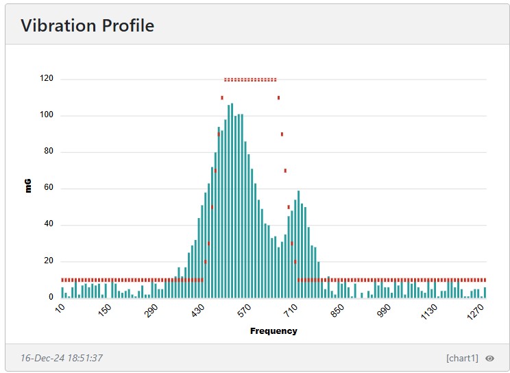
The process for creating a bar chart is similar except that the data to be displayed must be sent from the Senquip device as an array of numbers. The array must be turned into a JSON string object before being dispatched. Each element of the array represents the height of the associated bar.
Example - Reading a Vibration Profile and displaying it as a bar chart.
The following vibration chart was created by reading 128 frequency bins from a vibration sensor and sending them as a stringified array. The required code is summaried below. Also in the example below, a goal value within which the vibration profile must remain is dispatched to the Senquip Portal. The goal data is static (does not change often), therefore it does not need to be dispatched on every cycle. To set a series as a goal, use the Mark as Goal option in the chart series menu.
...letprofile=readVibrationProfile();// this is an arraySQ.dispatch(12,JSON.stringify(profile));...letgoal=[10,10,10,10,10,10,10,10,10,10,10,10,10,10,10,10,10,10,10,10,10,10,10,10,10,10,10,10,10,10,10,10,10,10,10,10,10,10,10,10,10,10,10,20,30,50,70,90,110,120,120,120,120,120,120,120,120,120,120,120,120,120,120,120,120,110,90,70,50,30,20,10,10,10,10,10,10,10,10,10,10,10,10,10,10,10,10,10,10,10,10,10,10,10,10,10,10,10,10,10,10,10,10,10,10,10,10,10,10,10,10,10,10,10,10,10,10,10,10,10,10,10,10,10,10,10,10,10,10];if(cycle===50){SQ.dispatch(13,JSON.stringify(goal));}...
A single y axis is generated and vibration and goal data are added as series.
Note
The Mark as Goal option is ticked to load historic goal data when current values are missing, avoiding the need to resend unchanged data in every packet.
Example bar chart showing a vibration profile and goal
Example bar chart showing a vibration profile and goal
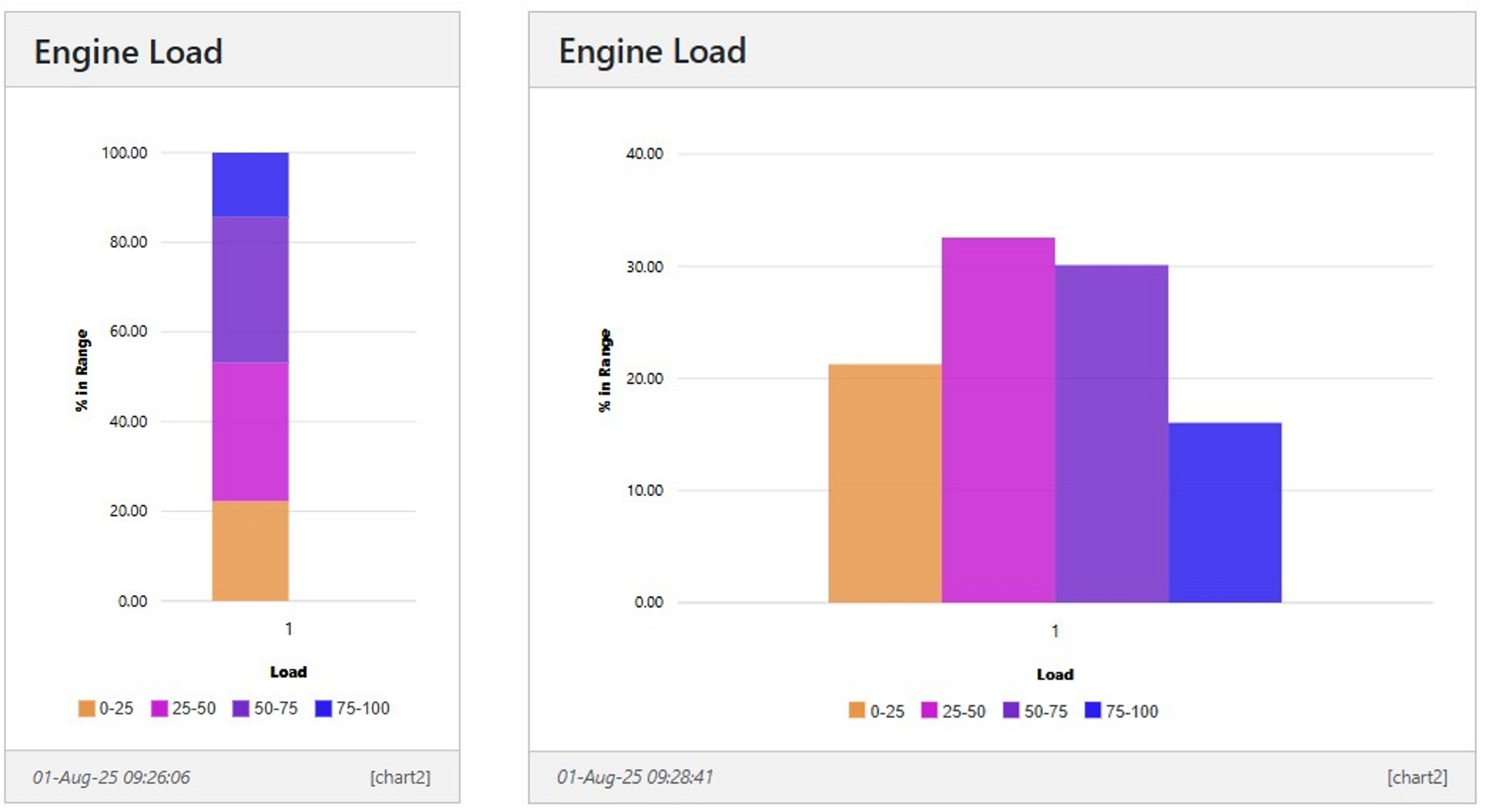
Example Machine load statistics on a bar chart
In this example, states are used to track how long a pump operates within specific load ranges. These ranges are grouped into bins: 0-25%, 25-50%, 50-75%, and 75-100%. The percentage of time the pump spends in each bin is calculated, and the results are displayed in a bar chart.
// Create a load chartletload25=[];letload50=[];letload75=[];letload100=[];// Simulate some dataload25[0]=20+3*Math.random();// 0 to 25load50[0]=30+3*Math.random();// 25 to 50load75[0]=30+3*Math.random();// 50 to 75load100[0]=100-load25[0]-load50[0]-load75[0];SQ.dispatch(31,JSON.stringify(load25));SQ.dispatch(32,JSON.stringify(load50));SQ.dispatch(33,JSON.stringify(load75));SQ.dispatch(34,JSON.stringify(load100));
A single y axis is specified, and each bar is loaded as a seperate series.
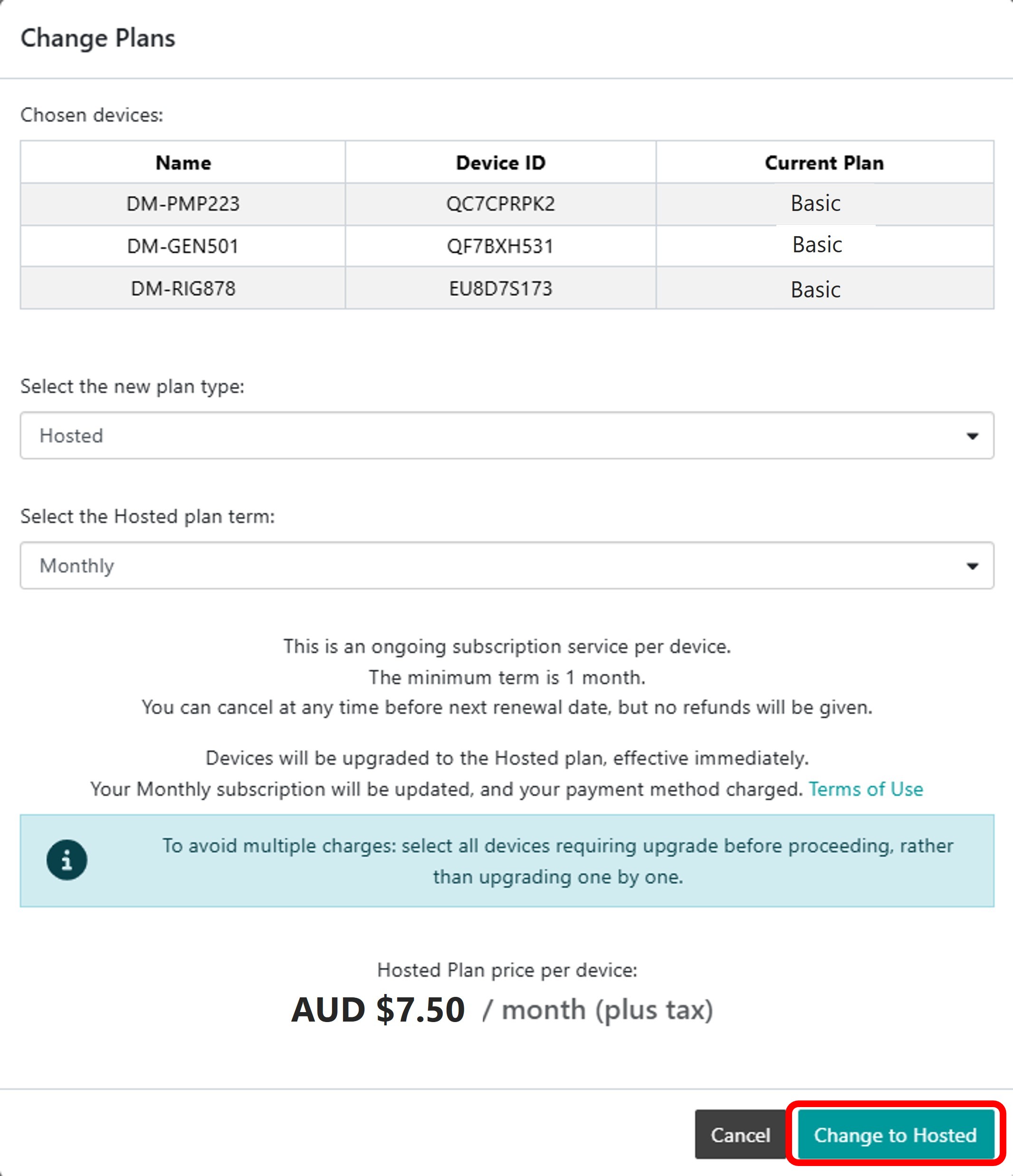
The Senquip Portal offers hosting of data, a data visualisation dashboard, firmware upgrades, and device management including remote configuration and scripting. Every Senquip device purchased comes with a managed plan for the life of the product (10 years). Managed plans allow remote configuration and scripting on the Senquip Portal. Users have the option of purchasing a hosted plan to enable data hosting and data visualisation on the Senquip Portal. Hosted plans are available on a monthly, yearly, or lifetime basis (10 years), and can be purchased directly off the Senquip Portal or through distributors.
Zero cost Basic plans are most suitable for users who are hosting their data on their own server and have their own dashboards. Features of the management plan include:
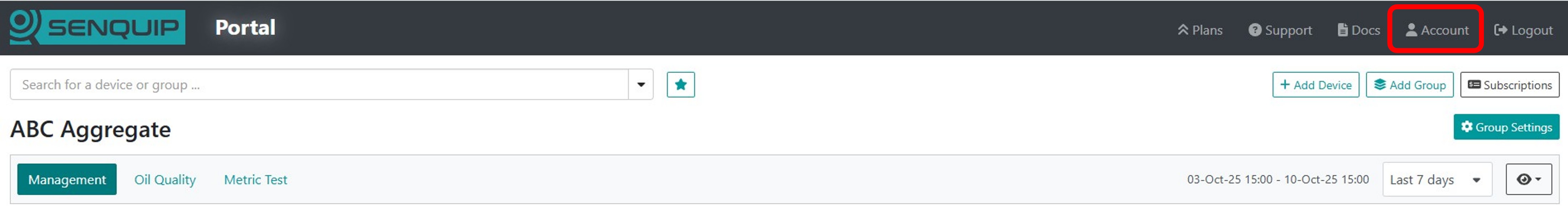
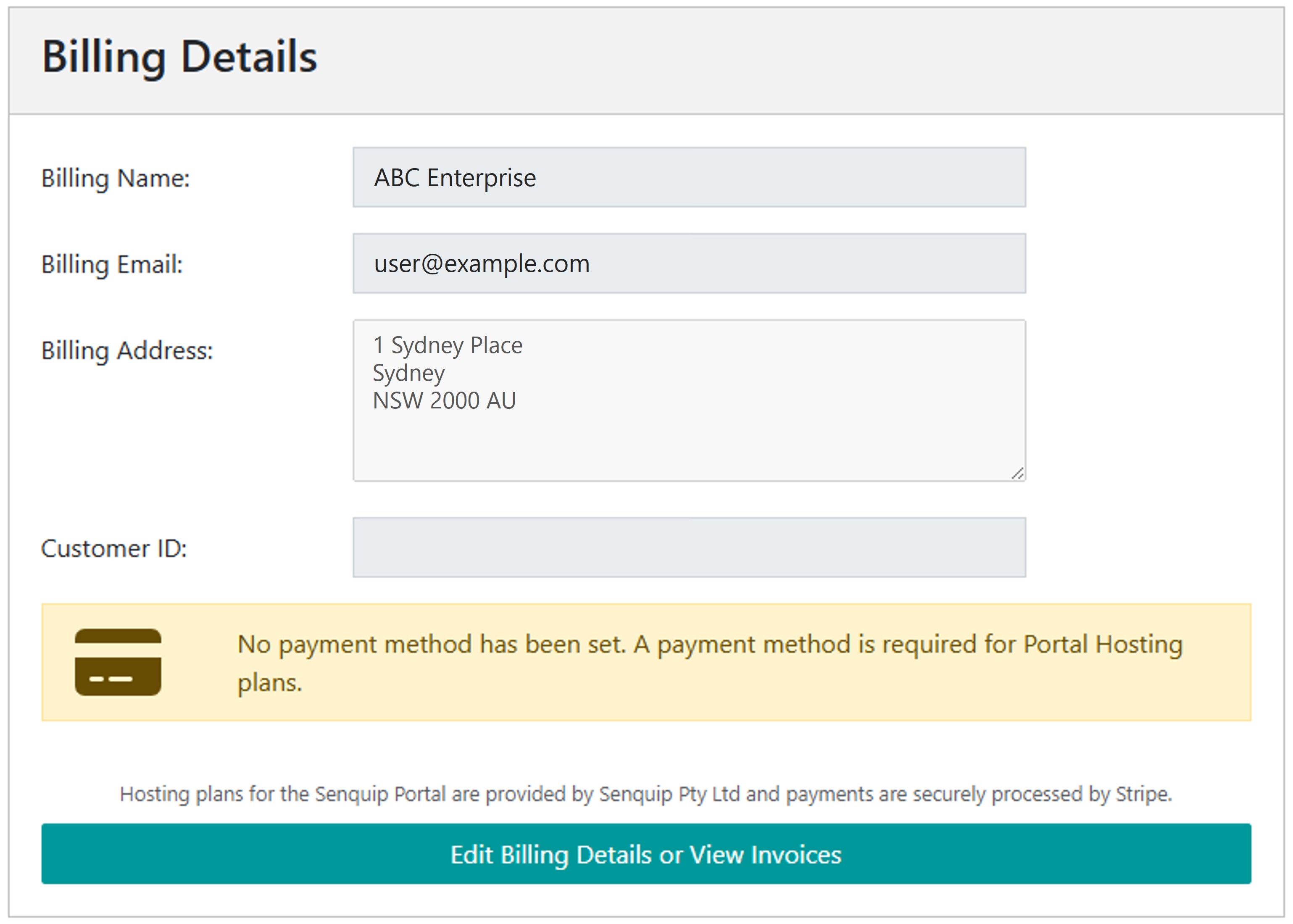
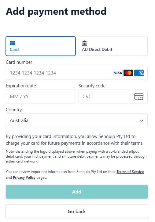
To add a hosted plan to a device, a user must have a payment method associated with their Senquip Portal account. Billing details are accessed by selecting Account from the toolbar at the top of any page on the Senquip Portal.
Hosting plans for the Senquip Portal are provided by Senquip Pty Ltd and payments are securely processed by Stripe. Senquip does not store credit card details.
Once a payment method is available, users can add hosted plans to their subscription.
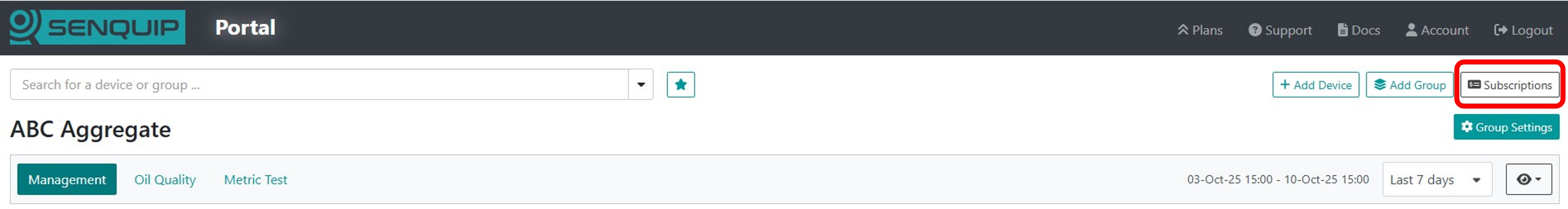
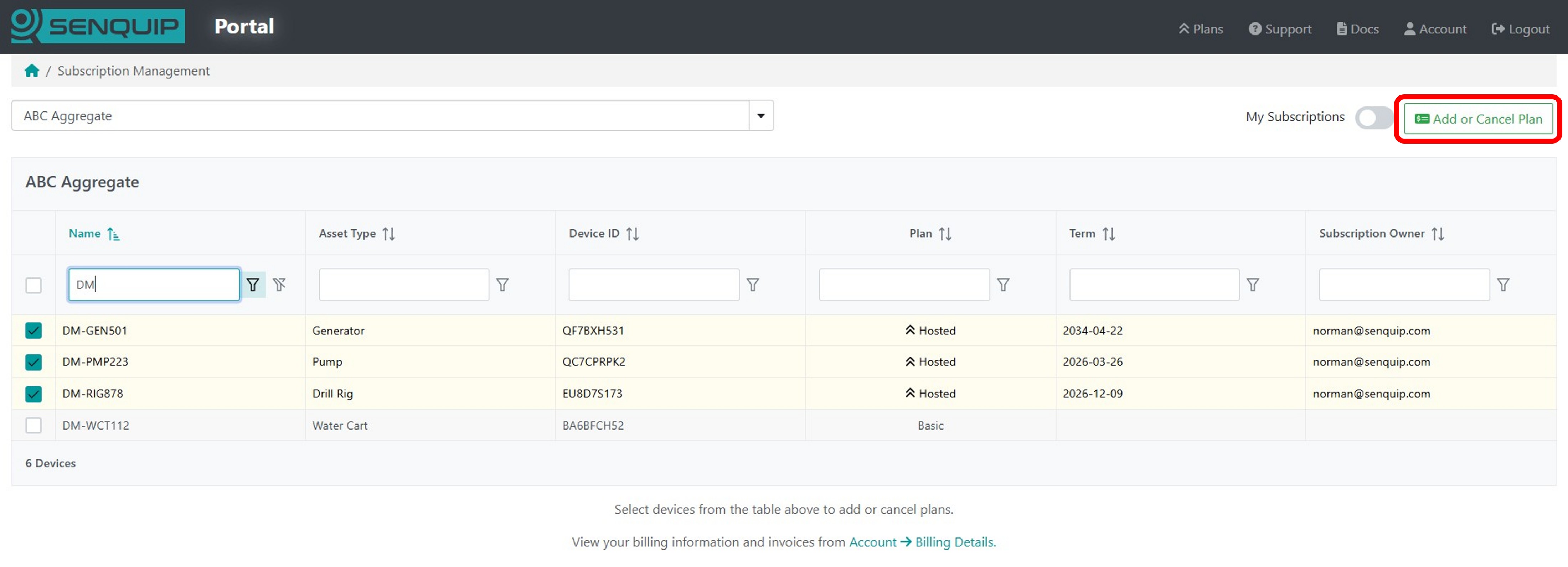
To add or canel hosting on devices:
from the Senquip Vision Dashboard, select Subscriptions
When adding hosting, select either Monthly or Yearly. A discount is given for yearly subscriptions.
To host devices, select Change to Hosted
to cancel hosting and return devices to a basic plan, select Change to Basic
Note
Plans can be cancelled at any time. The cancellation will be immediate and no further billing will take place. Refunds will not be issued when a plan is cancelled mid term.
Note
If a hosted plan is added in the middle of a month, a pro-rate payment for the balance of the month will be invoiced. Once one hosted plan has been added, further hosted plans will be billed on the same date as the first plan.
Warning
Where plans are cancelled, any data stored on the Portal for these devices will be lost.
When a staff member leaves an organisation, their access to Senquip devices should be removed and transferred to another user.
If your devices are organised into a Group, replacing a user is simple:
Create a Senquip Portal account for the new user if they do not already have one.
Add the new user to the Group with the required permissions.
Remove the previous user from the Group.
All devices in the Group will automatically inherit the updated permissions.
If the device is not part of a Group, the new administrator must be added to each device individually. This can be done in one of two ways.
If the device setup password is available:
Create a Senquip Portal account for the new user.
Select Add Device and enter the Device ID and setup password.
The device will be added to the new user’s account with ADMIN permissions.
Open the device page and select ADMIN to remove the previous user.
If the previous administrator’s Portal login is available:
Create a Senquip Portal account for the new user.
Login using the previous administrator’s account.
Open the device page and select ADMIN.
Add the new user as an ADMIN.
Remove the previous user.
Login using the new user’s account to verify access.
Tip
For organisations managing multiple devices, it is recommended that devices
are placed into Groups. User access can then be managed at the Group level,
allowing staff changes to be made once rather than on every individual
device.